5 Basic Landing Page Layouts
Design

In the ever-evolving world of web design, the landing page serves as the gateway to a brand's digital universe. It's the first impression that visitors encounter, setting the tone for their journey and shaping their perception of the brand. As web design professionals, understanding the different layout options available allows us to tailor our approach to meet the unique needs and objectives of each project. Join us as we explore five basic website landing page layouts, each offering its own blend of functionality, aesthetics, and user experience.
Full-Screen Hero

The full-screen hero layout is a bold and impactful design choice that immediately grabs visitors' attention. By utilizing a captivating, full-screen hero banner, brands can showcase striking visuals or convey key messages in a visually stunning manner. This layout is perfect for brands looking to make a memorable first impression or highlight a specific product, service, or campaign. With the hero section dominating the screen, visitors are immersed in the brand's narrative from the moment they land on the page, setting the stage for a compelling user experience.
Grid-Based

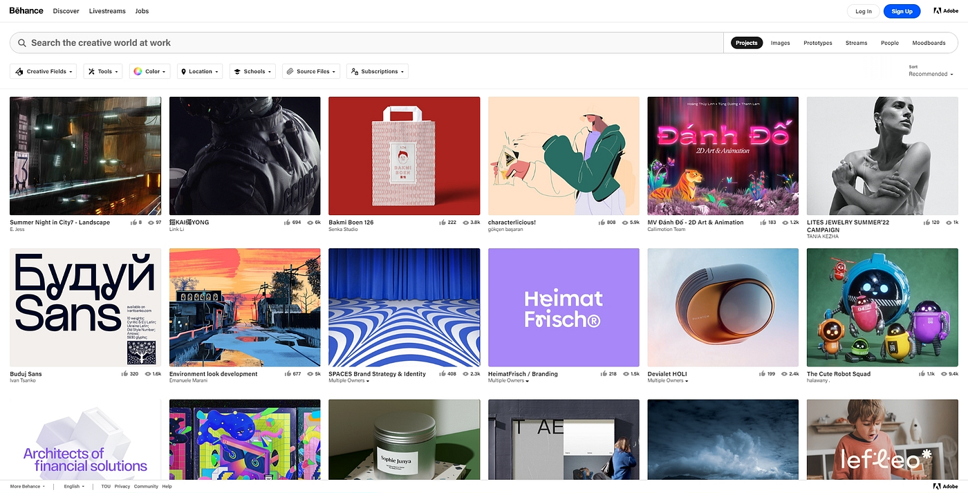
Ideal for creative professionals and agencies, the grid-based layout offers a structured and visually appealing way to showcase portfolios, projects, or services. By organizing content into a grid format, brands can present a diverse range of offerings in a cohesive and digestible manner. Each grid element serves as a visual entry point, inviting visitors to explore further and engage with the brand's offerings. Whether it's showcasing design work, photography, or case studies, the grid-based layout allows for flexibility and creativity in presenting content.
Single-Page Scroll

Simplify navigation and streamline the user experience with a single-page scroll layout. This minimalist approach condenses all essential information into a single, continuous page, eliminating the need for multiple clicks or page reloads. Visitors can seamlessly navigate between different sections of the page by scrolling, creating a fluid and intuitive browsing experience. From the hero section to product features, testimonials, and contact information, the single-page scroll layout ensures that every piece of content is easily accessible and optimized for engagement.
Card-Based

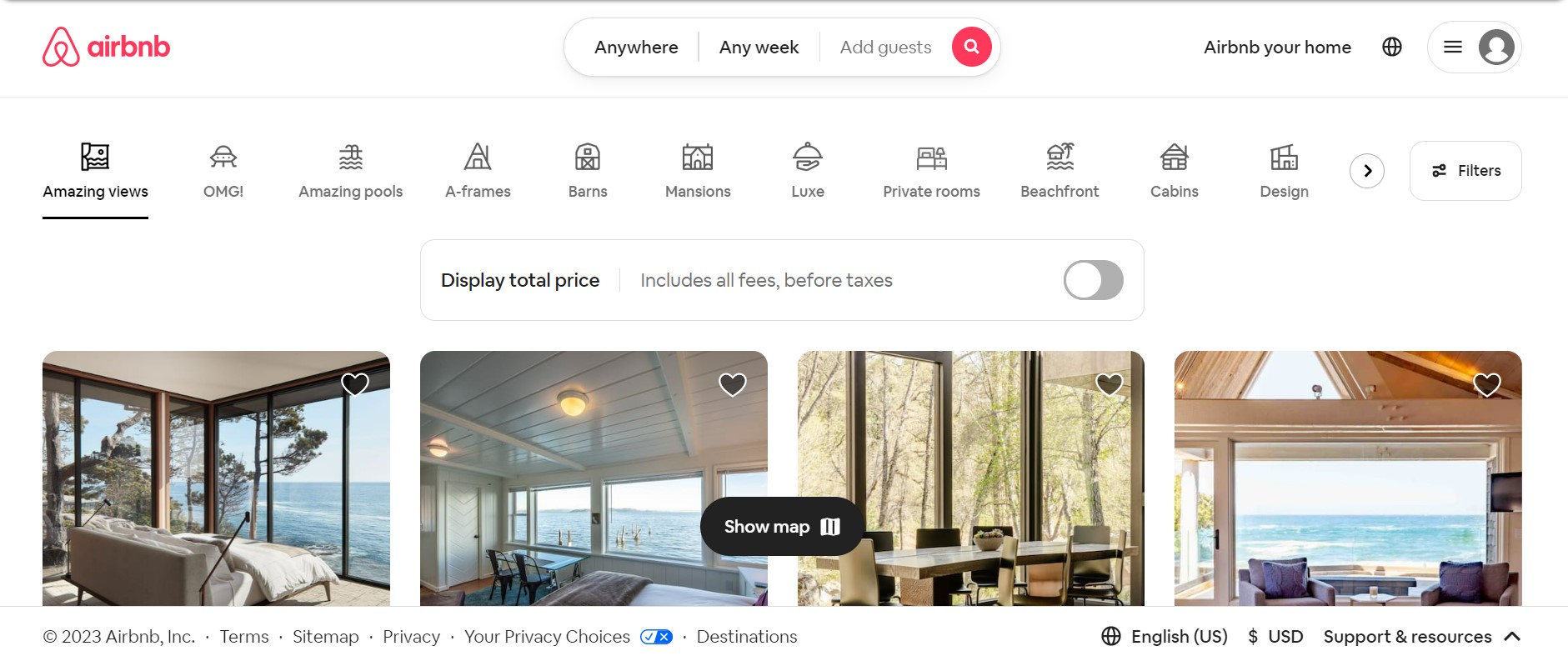
Highlight content and services with a card-based design, where information is presented in bite-sized, visually appealing cards. This layout is perfect for organizing and presenting information in a structured and easy-to-absorb format. Each card serves as a standalone unit, containing key details such as product features, pricing options, or blog posts. The card-based layout allows brands to showcase a variety of content types while maintaining consistency in design and layout. Whether it's highlighting products, services, or blog articles, the card-based layout makes it easy for visitors to find and digest relevant information.
Masonry Grid
:max_bytes(150000):strip_icc()/21SelectPin-abd3f511438e4e96867cdd4f8445224e.jpg)
Create a dynamic and asymmetrical layout with the masonry grid, allowing for versatile content presentation. This layout is characterized by its overlapping and staggered grid elements, creating visual interest and movement on the page. The masonry grid is ideal for blogs, portfolios, and e-commerce sites, where a diverse range of content needs to be showcased in an engaging and visually compelling manner. By breaking away from traditional grid structures, the masonry grid offers flexibility and creativity in content organization, allowing brands to showcase their offerings in a unique and memorable way.
In conclusion, the choice of landing page layout plays a crucial role in shaping the user experience and communicating the brand's message effectively. Whether it's a full-screen hero, grid-based layout, single-page scroll, card-based design, or masonry grid, each layout offers its own set of advantages and can be tailored to meet the specific goals and objectives of the brand. By understanding the strengths and characteristics of each layout option, web design professionals can create captivating digital experiences that resonate with visitors and drive meaningful engagement.